Customize display
Use the Integration Submission Form to customize how the Sonos app displays your service.
The submission form allows configuration of:
- Unified Search
- Hi-Res Custom Browse Icons
- Hi-Res Album Art
- SMAPI Ratings
Unified Search
If your service supports the ability to search content, then you must configure search in your submission form. See Add search for details.
Hi-Res custom browse icons
If your service supports custom browse icons, you must configure this feature in your submission form. You must implement two styles of icons, one for mobile and one for desktop Sonos apps, and configure a set of substitution rules to enable the Sonos app to select and display the correct icon depending on OS platform and app version. See Add browse icons for details.
Hi-Res album art
If your service delivers album art on the Now Playing screen for music that is playing, you must configure this feature in your submission form. Configure a set of substitution rules to enable the Sonos app to select and display the correct album art depending on OS platform and app version. See Add album art for details.
SMAPI ratings
If your service allows a listener to rate a track or stream, then you must configure this feature in your submission form. This configuration sets up the ratings UX for the Now Playing screen in the Sonos app. The submission form configuration includes definition of the icons used in the UX, what tags the Sonos app should look for when determining which icon to show, and what values will be submitted in rateItem when a listener taps a rating on the Now Playing screen. See Add ratings for details.
Customize items with display types
You can customize how Sonos Android and iOS Sonos apps display items such as albums, tracks, and playlists by using display types. Display types determine how Sonos apps display items such as albums, tracks, and playlists. You can use them to determine how Sonos apps display album art and lines of text for these items. Set up display types in your submission form by specifying one of the following display types:
- Grid
- List
- Hero
- Editorial
Set up display types using display modes
You can use the following display modes when setting up display types.
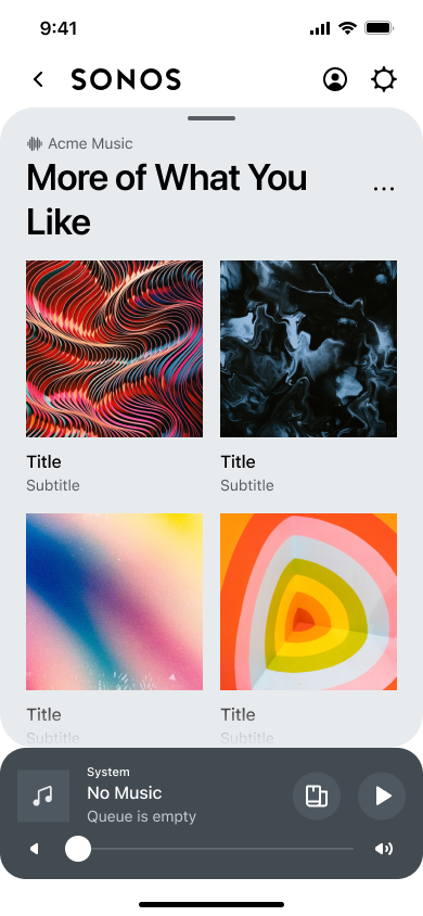
Grid
The GRID display mode displays items in a grid, with tile-sized album art displayed above a maximum of two lines of text. The Sonos app will show default album art if you don't provide any.

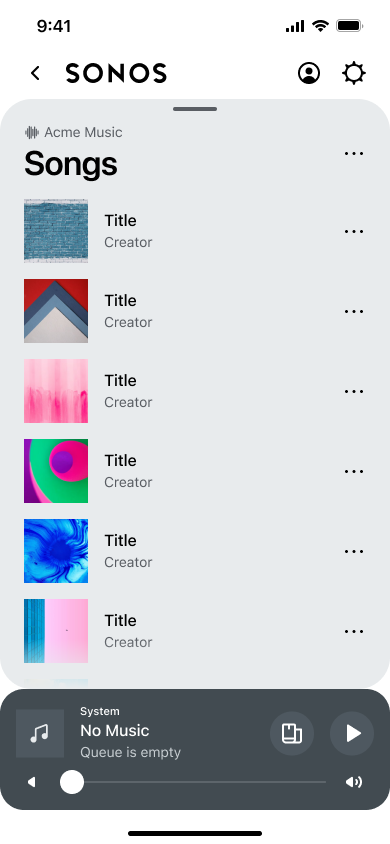
List
The LIST display mode displays items in a list, with small album art and a maximum of two lines of text displayed to the right. Sonos apps will show default album art if you don't provide any.

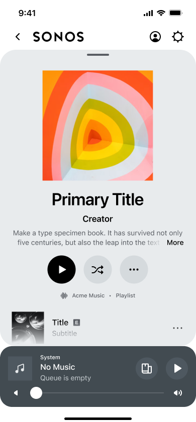
Hero
The HERO display mode shows a container, such as an album or playlist, with a header and a list of child elements within the container. The header includes an image and up to three lines of text. The child elements can contain a thumbnail and up to three lines of text, depending on the child element's display type. On tablets, the header is listed on the left side of the screen, with the text below, and the child elements on the right. On phones, the header is listed at the top, with the text to the right of the image, and the child elements below.

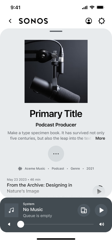
Editorial
The EDITORIAL display mode displays album art and can include up to three lines of text. By default, it displays two lines: title and summary. Sonos app show the title and summary to the right of the album art.

Updated 16 days ago
Learn more about how to customize your content in the Sonos app:
