
Configure display types
To select a display types for containers, you'll need to:
- Choose a display type from the Type field.
- (Optional) Configure the text for the type.
- Configure your getMetadata,
mediaMetadata, andmediaCollectionelements to returndisplayTypeandsummarymetadata for containers that use these elements.
Select display types
To select a display type:
- Navigate to the Browse Options page of your Integration Submission Form.
- In the Container Display section, fill out the "Name" field.
- Select your desired display type from the "Type" field.
There are five display types available:
- Grid
- List
- Hero
- Editorial
- Hero Editorial
Select item adornment
An item adornment is an element that is located the furthest left in the container. In many displays, this element is album art.
To choose an item adornment for the container, select one from the "Item Adornment" field.
There are 3 options:
- Image - an image, most commonly album art
- Ordinal - an integer based on the position of the resource in the container
- None - No adornment
Configure text
To configure the text in a container, you can fill out the "Text" fields on the Browse Options page.
There are 3 possible text fields for the header section and 3 fields for the item section of a container.
Header
- Header Text Title
- Header Text Subtitle
- Header Text Summary
Item
- Item Text Title
- Item Text Subtitle
- Item Text Summary
The text fields are listed in order of appearance in the Sonos app.
Not every container type can facilitate every text type. The form will provide you with your available options after you select a display type.
Configure getMetadata responses
getMetadata responsesWhen you want to display items using your new display type, return it in the getMetadata response. For example:
<s:Envelope xmlns:s="http://schemas.xmlsoap.org/soap/envelope/" xmlns:ns="http://www.sonos.com/Services/1.1">
<s:Body>
<ns:getMetadataResponse>
<ns:getMetadataResult>
<ns:index>0</ns:index>
<ns:count>10</ns:count>
<ns:total>10</ns:total>
...
<ns:mediaCollection>
<ns:id>browse:genreList</ns:id>
<ns:itemType>container</ns:itemType>
<ns:displayType>genreGrid</ns:displayType>
<ns:title>Genres</ns:title>
<ns:canPlay>false</ns:canPlay>
<ns:containsFavorite>false</ns:containsFavorite>
<ns:albumArtURI />
</ns:mediaCollection>
...
</ns:getMetadataResult>
</ns:getMetadataResponse>
</s:Body>
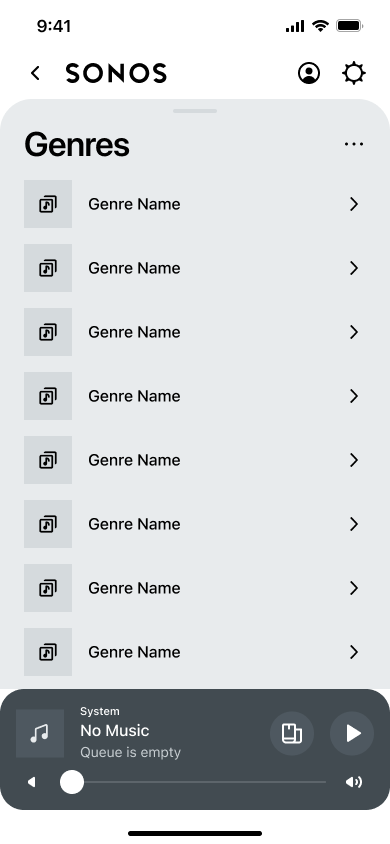
</s:Envelope>When you return mediaMetadata or mediaCollection to a getMetadata request, the displayType for the item determines how it is displayed on the controller. For example, Sonos controllers display the mediaCollection shown above as a genreGrid display type when a user browses into it:
The getMetadata response for the container includes the Cooking Playlist:
<s:Envelope xmlns:s="http://schemas.xmlsoap.org/soap/envelope/" xmlns:ns="http://www.sonos.com/Services/1.1">
   <s:Body>
      <ns:getMetadataResponse>
         <ns:getMetadataResult>
            <ns:index>0</ns:index>
            <ns:count>4</ns:count>
            <ns:total>4</ns:total>
            ...
            <ns:mediaCollection>
               <ns:id>cooking</ns:id>
               <ns:itemType>container</ns:itemType>
               <ns:displayType>genreMood</ns:displayType>
               <ns:title>Cooking Playlist</ns:title>
               <ns:summary>Enjoy music while preparing food for friends and family.</ns:summary>
               <ns:canPlay>false</ns:canPlay>
               <ns:albumArtURI>https://example.com/assets/images/boost.jpg</ns:albumArtURI>
            </ns:mediaCollection>
            ...
         </ns:getMetadataResult>
      </ns:getMetadataResponse>
   </s:Body>
</s:Envelope>